Rice Workshop infuses Japanese art into its new brand design
Channels the perfect origami fold.
Rice Workshop has looked into the use of colour and repurposing the existing materials available at the existing store to incorporate into the new store concept and secondary brand refresh.
"The design inspiration has been channeled around the perfect origami fold and how the fold is so essentially Japanese, yet constantly contemporary," explains David Loh, Founder of Rice Workshop.
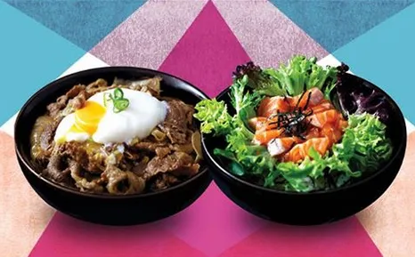
Loh and design consultancy firm Brand-Works worked together to create an iconic secondary brand story that created a look that would be synonymous with the Rice Workshop name. "The previous branding was quite dark and monochrome, where as the new secondary branding is quite fresh and colourful using geometric shapes that draw resemblance from Japanese icons such as Mount Fuji," he noted.
Adding, "there are new softer colours and the logo has been refined, making it cleaner and crisper – more in line with the brand ethos."
However, he emphasized that every store will have its own unique personality but will always embody the refreshed brand concept and design. The new design and architectural focus can be seen at their soon to open store in Fountain Gate.
